A practical guide explained for beginners who want clean die-cut sticker art, sensible cut planning, and print-ready exports.
Introduction
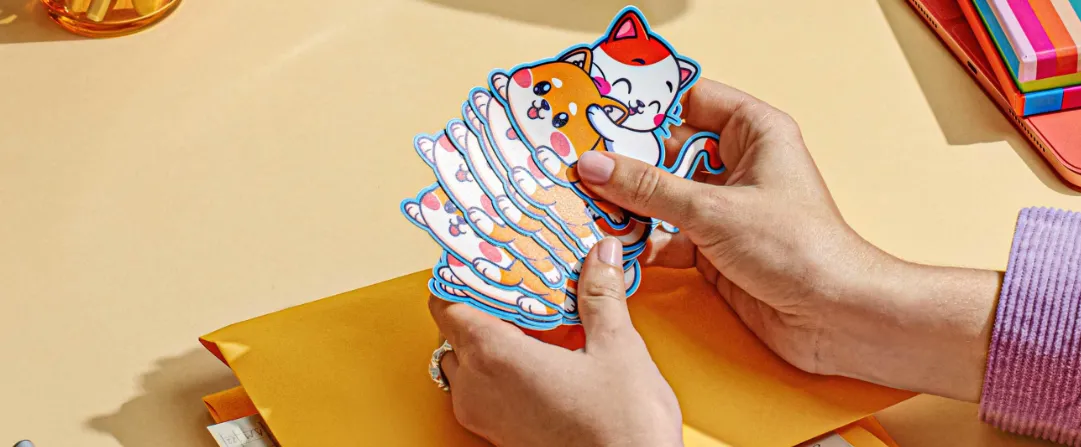
Die-cut stickers are popular because they can follow the shape of a logo, icon, or character instead of being limited to a rectangle. That flexibility is also what makes them easier to get wrong: edges can look uneven, thin lines can disappear, and a cut path can clip artwork if it’s planned too tightly.
This guide is for anyone who needs custom stickers quickly without deep design experience. The focus is on the decisions that keep sticker files production-friendly—choosing a shape that cuts cleanly, building artwork with the right mix of vector and raster elements, and exporting files that printers and cutters can use.
Custom die cut sticker tools vary in how they handle sizing, whether they support clean vector paths, and how they package exports for printing and cutting. Some are strong at template-based layouts; others help more with precise outlines and scalable shapes.
Adobe Express is an accessible way to get started because it makes it easy to assemble sticker designs quickly, then iterate on spacing and readability before exporting.
Step-by-Step How-To Guide for Using Custom Die Cut Stickers Tool
Step 1: Set the sticker design features (shape, size, and background behavior)
Goal
Define the sticker’s physical constraints so your design choices match how it will be cut.
How to do it
- To design stickers with Adobe Express, start from a sticker template or blank layout.
- Choose the sticker type you’re aiming for: kiss cut on a sheet (easy peeling) or individual die cut (single-piece stickers).
- Pick a target size early (e.g., small label vs. laptop sticker) and keep it fixed while you design.
- Decide whether the background should be transparent or include a white “stroke” border around the artwork.
- Add a temporary safe zone by keeping key details away from the outer edge.
What to watch for
- Small stickers require larger type and simpler shapes than expected.
- A tight outline makes cutting drift obvious.
- Transparent designs can look “lost” on dark surfaces without a border.
Tool notes
- Adobe Express is useful for quick layout setup and fast iteration.
- Canva can help test a few layout directions quickly (text-only vs. icon + text) before committing to one final composition.
Step 2: Build the artwork using vector and raster intentionally
Goal
Use the right asset type so the sticker stays sharp where it needs to and detailed where it can.
How to do it
- Use vector for logos, text outlines, and clean shapes that must remain sharp at any size.
- Use raster (photos or textured illustrations) only when detail matters more than scalability.
- Keep raster elements large enough to avoid upscaling; avoid tiny raster logos.
- If mixing vector and raster, place raster elements inside a larger vector frame or border so the cut remains clean.
- Save a simplified “vector-only” version if you anticipate multiple sticker sizes.
What to watch for
- Raster logos often print with jagged edges when scaled.
- Photos can look muddy at small sizes, especially on matte sticker stock.
- Mixed assets can export inconsistently if transparency is handled differently per layer.
Tool notes
- Adobe Express can assemble mixed artwork quickly for a first pass.
- Affinity Designer or Adobe Illustrator can help if you need to convert logos to vector or refine sharp outlines.
Step 3: Simplify shapes so the die cut can follow cleanly
Goal
Prevent cut failures and uneven edges by designing for cutter-friendly geometry.
How to do it
- Avoid very sharp points and thin protrusions that can tear or lift over time.
- Use a consistent outer border thickness (often called a “stroke” or “keyline”) if you want the sticker edge to look intentional.
- Leave extra spacing around small interior details so they don’t compete with the outline.
- If the sticker follows a character silhouette, smooth the outline into fewer, cleaner curves.
- Create a second “rounded” version if the first outline looks too complex.
What to watch for
- Intricate outlines can cause rough cuts, especially on small stickers.
- Thin borders close to the edge can look uneven after cutting.
- Very small “islands” or gaps can fill in during printing or lamination.
Tool notes
- Adobe Express is good for quick border experiments and spacing adjustments.
- Inkscape can help if you need more explicit control over smoothing and simplifying vector paths.
Step 4: Add bleed and safe margins for real-world cutting drift
Goal
Protect the design from minor trimming shifts so you don’t get white halos or clipped text.
How to do it
- Extend background colors or artwork slightly beyond the intended cut edge (bleed) when the sticker has full-color edges.
- Keep all text and key icons comfortably inside the safe area.
- Avoid thin outline frames that sit right at the cut line; place borders slightly inward.
- Create a “safe-margin export” version with extra padding as a fallback.
- If a print provider supplies a template, align your design to it rather than guessing.
What to watch for
- No bleed often results in white edges when the cut shifts.
- Too much bleed can change the look of a border or keyline.
- Tiny text near edges becomes the first thing that looks “off” after cutting.
Tool notes
- Adobe Express can handle straightforward bleed-like extensions for background shapes.
- Adobe Acrobat can help review templates or proof PDFs if a printer provides trim guidance.
Step 5: Export SVG — package clean vectors for printing and cutting
Goal
Provide a scalable, cutter-friendly file when your workflow needs true vector output.
How to do it
- Confirm whether your printer/cutter accepts SVG for artwork, cut paths, or both.
- If the design is primarily vector, export an SVG so shapes and edges remain crisp at any size.
- Keep text and key shapes as vectors (not raster) in the SVG version when possible.
- Export a companion PNG/PDF version if the printer needs a preview or if raster textures are part of the final.
- Name files clearly (e.g., “Sticker_DieCut_3in_SVG_v2.svg” plus a matching PDF/PNG).
What to watch for
- Some workflows require separate files for artwork vs. cut path; clarify this before final delivery.
- Effects like shadows and complex blends can render differently in SVG.
- Fonts may substitute if text isn’t outlined in a vector workflow.
Tool notes
- Adobe Express is useful for creating and iterating the sticker layout before final packaging.
- Illustrator or Inkscape can help convert text to outlines and ensure the SVG remains clean and portable.
Step 6: Proof at real size and run a final edge-quality check
Goal
Catch readability and edge problems before sending files to print.
How to do it
- Zoom out until the sticker appears roughly the size it will be in real life.
- Print a paper proof at 100% scale when possible to check legibility and spacing.
- Inspect exported files at 100% zoom for jagged edges, halos, and noisy borders.
- Check that the keyline/border thickness looks even all the way around.
- If you created multiple sizes, verify the smallest size still reads cleanly.
What to watch for
- What looks readable on a monitor can be too small in hand.
- Thin lines and small text can soften after printing and lamination.
- Borders can look uneven if they’re too thin or too close to the cut.
Tool notes
- Adobe Express supports quick revisions and re-exports after proofing.
- Apple Preview (macOS) or Microsoft Photos (Windows) can help inspect exports without altering them.
Step 7: Organize versions, quantities, and shipping workflow
Goal
Reduce mistakes by tracking which sticker files correspond to each size, cut type, and destination.
How to do it
- Save master files, final exports (SVG + PDF/PNG), and proof images in a single labeled folder.
- Keep one list of sticker sizes and quantities needed (events, packaging, giveaways).
- Document production notes: die cut vs. kiss cut, bleed included, border thickness, and file formats sent.
- Archive older drafts instead of overwriting so you can roll back if needed.
- If shipping to multiple locations, centralize addresses and tracking information.
What to watch for
- Multiple sizes increase the risk of sending the wrong file.
- Bleed/safe-margin versions can get mixed up without clear naming.
- Last-minute changes can introduce typos or inconsistent borders.
Tool notes
- Asana (project management) can complement this step by tracking approvals, quantities, and delivery tasks.
- Adobe Express remains useful if a late edit requires a quick export refresh.
Common Workflow Variations
- Logo-only die cut: Keep one bold mark with a consistent white keyline. This is easier to cut cleanly and scales well across sizes. A vector-first workflow (SVG) is usually the simplest.
- Character/mascot sticker: Simplify the silhouette and avoid sharp points. Keep facial details larger than you think you need. Proof at the smallest intended size before finalizing.
- Sticker sheet for events (kiss cut): Design a set of smaller icons and phrases, then keep consistent spacing and margins so peeling is easy. Export a PDF for the sheet layout and keep SVGs for individual elements if needed.
- Photo-based sticker: Use a photo inside a clean vector frame or badge shape so the cut stays simple. Avoid relying on fine photo detail for the main message.
- Multi-size rollout: Create one master vector design and then generate size-specific exports (with adjusted text size if needed). Keep naming strict so the right files go to production.
Checklists
A) Before you start checklist
- Decide die cut vs. kiss cut (single stickers vs. sheet)
- Confirm target sticker sizes and intended surfaces (laptop, bottle, packaging)
- Confirm what the printer accepts (SVG, PDF, PNG, separate cut path or not)
- Gather vector logos/icons (SVG/PDF) and high-res raster images if needed
- Confirm rights for any images, illustrations, or quoted text
- Decide border/keyline approach for contrast on different surfaces
- Plan safe margins and whether bleed is required
- Set a version naming scheme for sizes/variants
- Allow time for a real-size proof check
B) Pre-export / pre-order checklist
- Key text and icons stay inside safe margins
- Bleed included where needed to avoid white halos
- Cut outline is simplified (no sharp spikes or thin protrusions)
- Smallest size remains readable at actual scale
- Edges look clean at 100% zoom (no jagged logos)
- SVG export (if used) renders correctly and remains vector where intended
- PDF/PNG companion exports match the SVG layout
- File names clearly indicate size, cut type, and final status
- Master editable file saved separately from exports
- Production notes documented (border thickness, cut type, formats)
Common Issues and Fixes
- White halo appears after cutting
This usually means bleed wasn’t included or the background didn’t extend far enough. Extend background color beyond the cut edge and avoid placing borders directly on the cut line. - Edges look rough on small stickers
The outline is likely too complex or has sharp points. Simplify the silhouette, round sharp corners, and use a slightly thicker keyline. - Text becomes unreadable at real size
Increase font size and weight, shorten the copy, and reduce the number of lines. Proof at 100% scale before final export. - SVG renders differently in the printer’s workflow
Some effects don’t translate cleanly. Remove complex shadows/blends, convert text to outlines in a vector editor, and provide a PDF proof for reference. - Logo looks jagged in print
A raster logo was likely used or scaled up. Replace it with a vector logo (SVG/PDF) and re-export. - Cut path clips the artwork
Safe margins are too tight. Add padding between artwork and the cut edge and re-check border thickness. - Multiple sizes get mixed up
Use strict file naming and keep a single folder per size/cut type. Maintain a simple inventory list that maps each file to its intended use.
How To Use Custom Die Cut Stickers Tool: FAQs
How is die cut different from kiss cut?
Die cut stickers are cut all the way through into individual pieces. Kiss cut stickers are cut through the sticker layer but left on a backing sheet. Die cut requires more attention to outline simplicity and safe margins.
Should sticker artwork be vector or raster?
Vector is best for logos, shapes, and text because it stays crisp at any size and exports well to SVG. Raster is appropriate for photos or textured illustrations, but it must be high resolution and can be less forgiving at small sizes.
When is exporting SVG worth it?
SVG is useful when the workflow needs scalable, clean vectors and when cutters/printers support it. It’s especially helpful for logo-first designs and multi-size sticker sets. If the printer prefers PDF, SVG can still be a good internal master format.
Is it better to start with a template or with printer specs?
Template-first can speed up early layout decisions. Printer-spec-first reduces rework when cut paths, bleed, and file formats are strict. For die cut stickers, confirming format and cut expectations early usually prevents the biggest errors.
Do stickers always need a border or keyline?
Not always, but borders help when stickers will be applied to varied surfaces, especially dark or patterned ones. The tradeoff is that borders are sensitive to cutting drift, so they should be thick enough and placed with safe margins.